{friday finds: decorating with pretty pastels}

Painting with pastels in the spring.

For me, springtime brings to mind grass turning green, yellow daffodils unfurling, tulips blooming. The return of warm weather, blooming trees’ light petals and lilac bushes leave me drawn to springtime pastels and light, dreamy colors.

That’s my inspiration for this week’s blog—decorating with pretty pastels, whether the colors are found in prints, paint or accessories. How do you like to use pastels?

An important thing to keep in mind when decorating with pastels is balance and the “sometimes less is more” concept—you don’t want your home to look like an overgrown Easter egg. The neutrals or bright accent colors you use along with your pastels are critical to keeping the look sophisticated and on trend. If you’re painting and want to incorporate pastel blue, for example, how about using an intense green hue as an accent color?

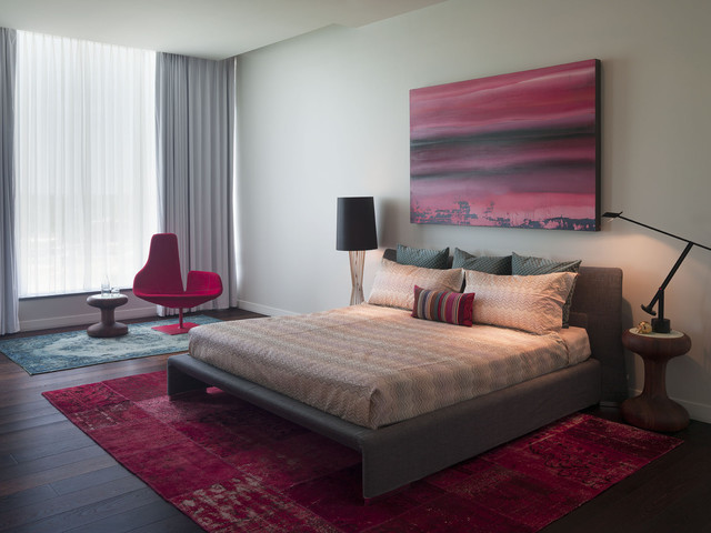
Contemporary Bedroom by Atlanta Photographers Erica George Dines Photography

Can pastels dazzle? This lovely lavender foyer is perfection. The dark gray console is a nice contrast against the pastel walls and also ties in with the lighter gray carpet runner.  Soft lavenders and purples always look their best when paired with trim painted white.
Benjamin Moore Organdy 1248

Paint color is Benjamin Moore 1248 –Mandarina Studio

 If you’re using yellow, you can be bold and use a bright plum as a contrasting hue.

Contemporary Living Room by East Hanover Lighting Capitol Lighting EH Division, INC

If you like pastels but aren’t sure how to use it in your home, feel free to stop by your local Hirshfield’s for paint advice in the Midwest. Their paint experts will have great ideas for you, and you can get wet paint samples to try at home before you paint an entire room or wall.

Accessories can also satisfy your pastel partiality in smaller doses. You can use a row of pillows in a similar family of colors like this summer porch to make a statement.

As you can see by these photos, pastel doesn’t mean wimpy or washed out. Using pastels the right way can add great color and interest to your home while retaining an atmosphere of sophistication and comfort.

Since Frank and Elizabeth Hirshfield opened their first store in 1894, it has been our mission to do the best job possible meeting customer needs and solving customer problems. Hirshfield’s. People and products you can trust. 

{decorating with pink and red}

Valentine’s Day Inspired Rooms

Valentine’s Day is coming near, and ‘tis the season to see red, pink and white wherever you turn. Yes, it can be too much when your local gift store has overdone it. But it can be fun to decorate at home with red and pink, whether it’s a temporary use of the colors in honor of the holiday or a color scheme you enjoy year-round.

Red
Personally, I love pops of red. The main living space in my home has accent colors of claret—mostly in an area rug, comfy throw and accent pillows. Red can warm up a space and add visual interest. However, you want to be careful when incorporating intense hues, especially reds. You don’t want to go overboard and end up with a space that feels intense or angry; you want reds that add positively to the vibe of a space. Depending on the tone and hue of the red you like, that might translate into an atmosphere that is energetic and has pizzazz, feels luxurious and elegant or seems rustic and comfortable. Since Hirshfield’s has paint in thousands of colors—more than 5,000 possibilities—you can acquire a paint sample to take home and try out before you commit to a color.

Read the rest of this entry »

{selecting paint: hirshfield’s color call}

Expert help on selecting paint colors.

Some people are born with a gift of knowing color and style. They sense instinctively what would look perfect in this space or that, what color would add a pop of visual interest, what neutrals work best in what lighting. Thankfully, for the rest of us who don’t have that innate knowledge, there’s help.

Hirshfield’s offers in-home color consulting, where a colorist comes to your home, sees your house’s layout and furniture and discusses your personal style, preferences and wishes for the space. The call lasts a little more than one hour. After the visit you’ll get a color plan mailed to you and a $20 gift card toward a Hirshfield’s paint purchase. The cost is $150, and color stylist Belinda Dietrich says that her clients tell her it is a valuable service and worth every penny.

Dietrich recommends that homeowners think about specific areas they want to focus on so that they can best use their time with the stylist effectively. They should spend some time beforehand visualizing the mood they want the space to imbue—cozy and intimate, bright and energetic, luxurious or elegant. Dietrich might ask her customer to find one thing they love in their space as an inspiration or focal point. Read the rest of this entry »