{friday finds: millennial pink}

millennial pink

Sonhas Rosa! An old Portuguese phrase for what we are all doing – dreaming in PINK!

It’s no secret, pink is having a moment. Whether you’re wearing it or drinking it (hello rose), it has come to be the defining color of the millennials, so much so that is referred to by many as “millennial pink”. But why? Read the rest of this entry »

{how to pick the right paint color for your home}

Painting the exterior of your home doesn’t happen often, so when you’re deciding on a color, you have to be 100% confident that this color will be timeless, elegant, and beautiful.

At Hirshfield’s, we carry countless exterior paint colors to choose from, giving you the freedom to explore to find the exact color you are looking for.

18835732_10155501724041323_3298177617928850325_n (1)

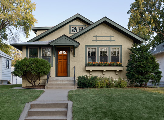
Siding: Sag Harbor Gray HC-95 Windowpanes: Midsummer Night 2134-20 Door: Gloucester Sage HC-100 All by Benjamin Moore

Here are some tips to consider when deciding on an exterior paint color for your home:

  • Consider pre-existing factors such as roof color, chimney, trim—if you aren’t planning on painting it—and landscape. Roof color is especially important because unless you completely re-roof your home, it isn’t going anywhere for a while. So instead, find an exterior paint color that complements the color of your roof.
  • If your home has stone, copper, or brick accents, consider a color that will accentuate the current elements that make your home truly beautiful.

Gray Benjamin Moore Exterior

Revere Pewter (HC-172), Night Train (1567), Firenze (AF-225)


  • When deciding on an exterior color, feel free to focus on not only the body of the home, but also the trimming, shutters, and door. It can really make a home come to life if all three of these components complement each other seamlessly.
  • Be aware that paint samples can often look darker or richer in-store than they will appear when they are applied to the exterior of your home. Don’t be afraid to sample paints before tackling the entirety of the project.
  • Take note of the color palette of the surrounding homes or landmarks in your neighborhood. Originality is important as you don’t want to completely blend in among the masses. However, showcase your individuality without stepping on neighbors’ toes (i.e. painting your home Pepto Bismol pink when the neighborhood has chosen a more neutral palette!)
Exterior paint colors

Lower Body is Hirshfield’s Historic Tankard Gray, Upper Body HC-87 Ashley Gray, Trim and Shutters, 0197 Thistle Gray. Color schemed by Mark Masica, Hirshfield’s Color Services

Neutral exterior colors have remained timeless and popular in Minnesota throughout the years. The above homeowner chose a neutral palette which really played up their stone accents nicely.

When selecting exterior paints be sure to check out Hirshfield’s and Benjamin Moore paints for durability, ease of application, resistance to mildew, mold, and UV rays, and overall performance.

benjamin moore paint regal select

REGAL SELECT ON SALE

Now through June 17, Regal Select Exterior and Interior Paints are $10 off per gallon.

Regal Select Interior available at all Hirshfield’s stores; Regal Select Exterior available at select Hirshfield’s locations. Regal Select Exterior may be special ordered in, or Benjamin Moore Aura Exterior may be purchased at $10 OFF msrp at all Hirshfield’s locations.

Happy weekend and painting!

Since Frank and Elizabeth Hirshfield opened their first store in 1894, it has been our mission to do the best job possible meeting customer needs and solving customer problems. Hirshfield’s. People and products you can trust.

{bachman’s spring ideas house 2017}

Bachman's Spring Ideas House 2017

Photo credit MSP Magazine

Urban Farmhouse

Each year the Bachman’s Spring Ideas House marks the end of winter and welcomes  a season of warmer weather and beautiful spring colors.

The theme for the 2017 Spring Ideas House is Urban Farmhouse. This transformation from season to season takes place in the historic Bachman family home on Lyndale Avenue. Truly an urban farmhouse.

A neutral background palette allows the colorful spring florals and accessories to be  focal points throughout the home. If you’ve never been to an Ideas House the design team does an amazing job creating charming vignettes with new items, up cycled pieces, and vintage pieces.

Look for these key trends for 2017:

  • Fresh contemporary meets vintage permanence
  • Shades of grey against farm fresh white to create warm contrast
  • Floral Patterns and Ditsy Prints add dimension to our simple farmhouse decor
  • Galvanized metal and reclaimed wood used for accent and function
  • Botanical greens from dominant fiddle leaf figs to refined ferns

Barn door Bachman's

Photo credit MSP Magazine

Read the rest of this entry »

{february color of the month: awakening 0560}

hirshfield's-paint-color-awakening

In sports, a utility player is one who can play several positions competently – a sort of jack of all trades. Hirshfeld’s February’s Color of the Month is just that. A color our employees go to when customers don’t want a gray and they don’t want a beige, but they want a neutral.

Awakening 0560 is a chameleon color.  It looks gray or it looks beige depending on the lighting in your home.  Some of our customers want to go gray (“because gray is all the rage, you know”) but can’t commit to a true gray without spending a lot of money changing their entire decor. Awakening is an excellent choice for hinting at the gray color trends.  You can see in the photo below it’s also a very flattering color when used with taupes, grays and browns.

Hirshfields-paints

Awakening 0560 is the backup singer allowing other design features in the room to take center stage – Bachman’s Ideas House

Cindy (Hirshfield’s Maple Grove) says it’s a color that should satisfy EVERYONE! Pay attention all you “I-don’t-know-what-color-I-want” people! This is the color for you.

img_4076

Since Frank and Elizabeth Hirshfield opened their first store in 1894, it has been our mission to do the best job possible meeting customer needs and solving customer problems. Hirshfield’s. People and products you can trust.


{friday finds: january color of the month}

Color of the Month: Morning Blush 1083

Morning Blush 1083

Bring in the New Year with this cozy, warm, and fresh morning blush pink! We are calling this the pink of pinks! Morning Blush doesn’t stand out, but flatters everything around it. It’s a warm pink with a touch of peach. Not necessarily feminine, but is elegant and sophisticated.

Read the rest of this entry »

{pantone 2017 color of the year: greenery}

pantone_color_of_the_year_2017_shop_banner

As we turn the corner of a new year with biting cold and heavy snowfalls here in the Upper Midwest, one way to warm up a bit is to discuss Greenery, the 2017 Pantone Color of the Year.

Pantone’s official announcement even mentioned spring as the inspiration: “Greenery is a fresh and zesty yellow-green shade that evokes the first days of spring when nature’s greens revive, restore and renew.”

It’s no surprise that Pantone picked a green tone. The Color Marketing Group picked Thrive as the North American Key Color 2017+, and we featured a green, Mother Nature 0746, as the Hirshfield’s Color of the Month for October.

The allure of green is the tie to nature and its feeling of rebirth and renewal. Pantone describes Greenery as “nature’s neutral, a versatile trans-seasonal shade that lends itself to many color combinations.” Read the rest of this entry »

{color of the month: spacebox 0493}

Hirshfield's Spacebox 0493

Hirshfield’s Color of the Month for December is Spacebox 0493, a green-blue-gray, depending on the light. Think of eucalyptus, the little berries on spruce tops, and the blue-green rosemaling color of years past.

spacebox 0493 hirshfield's

My Scandinavian Home shows Spacebox 0493 as an accent color warming up an all white  interior.

Read the rest of this entry »

{benjamin moore 2017 color of the year: shadow 2117-30}

Benjamin Moore Color of the Year 2017 Shadow 2117-30

Shadow 2117-30 | Benjamin Moore

The reaction to Benjamin Moore’s 2017 Color of the Year has been a bit of surprise and delight. Shadow 2117-30 is a deep, dark, subtle mixture of charcoal and purple.

House Beautiful called it “anything but neutral,” and Architectural Digest discussed the versatility of the “moody, amethyst hue.”

“I love it. It’s sophisticated, warm, and fresh. I can see it in a library or a small office. It would make a room feel cozy,” says designer Ally Banks of Ally Banks Interiors in the District, who is using the color on chairs, accent pillows and stools in a current project. – Washington Post

Read the rest of this entry »

{interior trim 101: five fool-proof whites for all your rooms}

paint colors

Picking a trim color can be tricky. You want one color to tie all of your rooms together, but you also need to complement the colors in each of those rooms.

The answer is off-white, right? Not so fast.

If you’ve ever tried a white with a green undertone in a pink-toned room (or maybe cream with red undertones in a blue room),  you realize that all whites are not created equal. Some are much more neutral than others.

So, we turned to experts from our Hirshfield’s stores —Sherry from Baxter and Faye from Woodbury — for some of their favorite fool-proof whites that will work in any room.

Read the rest of this entry »

{color of the month: seeing green with mother nature 0746}

This has been the year of natural and organic shapes and textures — from organic shapes at High Point Market to organic textures in the latest Thibaut books. And now, our color of the month is truly inspired by nature. Mother Nature, to be exact. Mother Nature 0746 is Hirshfield’s Color of the Month for October.

Mother Nature Paint color

Mother Nature 0746

Mother Nature 0746 is a fashion-forward, organic color — a deeper green that sits somewhere between yellow-green and blue-green. We’re seeing this as an emerging trend color in fabrics, accessories, and wallpapers used as a deep neutral.

And we’re not the only ones with green on our minds. The Color Marketing Group picked Thrive as the North American Key Color 2017+.  And that’s the point. “Green is a color of growth, of newness, and of wellbeing,” says CMG , “and Thrive will be the hue to carry us forward.”

big croc wallpaper

This jumbo croc wallpaper pattern is fashioned after handbags and is stunning in real life. Hirshfield’s Design Studio carries the book. 

Read the rest of this entry »