Friday Finds: Farrow & Ball Wallpaper

farrow&ball wallcovering

Farrow & Ball devotees know they can count on the brand’s ab-fab paint colors, cutting-edge wallpaper patterns, and exceptional quality. They also know how to be patient. Farrow & Ball introduces only a handful of wallpaper patterns each year and new paint colors are introduced to the Farrow & Ball palette every three years. This year’s wallpaper introductions are three modern floral designs that can work as feature walls or in a whole room. Here are the brand new patterns for 2017 and the inspiration behind them:

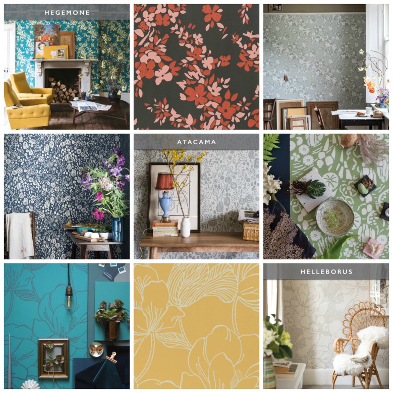
  • Hegemone takes it name from the Greek goddess of fruit and flowers. This pattern is described as “less rigid and defined than a classic floral pattern.” If you like movement on your walls then this is your pattern.
  • Atacama* is named after a flowering desert in Chile and inspired from a fabric swatch found in an old fabric mill. Atacama is a mix of flowers and cacti creating a “fun tropical design.”
  • Helleborus is Latin for the hellebore flower and inspires “a sense of growth and rejuvenation. Helleborous is one of the largest designs in their wallpaper collection.

Farrow & Ball wallpapers are made in England by craftsmen (and women) who take great pride in their workmanship. Printed with Farrow & Ball paints in a traditional block-printing method gives the wallpaper a luxurious texture. It also makes it easy to create a style that is cohesive and a room that is inviting since you won’t have to try and match up paint colors.

You’ll want to stop by to feel and see the new collection for yourself – available exclusively at our Edina location.

*Have you seen the James Corden commercial with Chase Sapphire? One of the travel people say, ” I think you should come camping.” James Corden: “Why would I camp in the Atacama Desert?” I feel so smart – I know where the Atacama Desert is. Thank you, Farrow & Ball.

Since Frank and Elizabeth Hirshfield opened their first store in 1894, it has been our mission to do the best job possible meeting customer needs and solving customer problems. Hirshfield’s. People and products you can trust.


{wallpaper wednesday: thibaut grasscloth resource vol. 4}

Established in 1886, Thibaut (pronounced Tee-Bo) is the nation’s oldest continuously operating wallpaper firm. Thibaut’s product offering has broadened to include a variety of coordinating print fabrics, furniture, embroideries, and woven upholstery fabrics. Here’s a look at their newest collection of natural wall coverings, Grasscloth Resource Volume 4 is filled with grasscloths, raffia, paper weaves, and sumptuous sisal.

With a palette that is both bold and sophisticated, the striking textures of these wallcoverings provide a level of natural beauty, depth and dimension that few other home decor products can rival.” 

Thibaut Grasscloth Resource Vol. 4

Piedmont is a large-scale printed chevron in multi-color layers. A hint of metallic shines through from the ground.

Read the rest of this entry »

(wallpaper wednesday: scandinavian designers II)

Scandinavian Designers II wallpaper book

Wallpaper. Scandinavian. Retro. This new wallpaper book has it all!

This collection features patterns from no less than five different designer icons within architecture and pattern design during the 1940’s – 1960’s. Browse through the characteristically timeless, geometric functional style of Arne Jacobsen, the decorative fairy tale patterns of Stig Lindberg, the Jobs sisters’ treasure chest of classic, flowery patterns and the stylish, sketched foliage of Viola Gråsten.

All of the patterns in the collection have a natural, colourful and imaginative touch that make them a perfect complement to the understated, clean Scandinavian interior design. Classic and contemporary have never been more to the point.

wallcovering by Scandinavian Designers II

The pattern with its stylized green leaves is one of the most loved by the Swedish people. The china was sold in immense quantities during the 1960’s and is considered an icon in Swedish homes today.

Read the rest of this entry »

{friday finds: millennial pink}

millennial pink

Sonhas Rosa! An old Portuguese phrase for what we are all doing – dreaming in PINK!

It’s no secret, pink is having a moment. Whether you’re wearing it or drinking it (hello rose), it has come to be the defining color of the millennials, so much so that is referred to by many as “millennial pink”. But why? Read the rest of this entry »

{artisan home tour 2017}

artisan home tour 2017

If you’re shopping for a new home, looking for inspiration, or thinking about a remodel, the Artisan Home Tour  should be on your weekend radar. Step inside these luxury homes, from the area’s most exclusive builders and remodelers, and see for yourself why these are million-dollar-plus homes.

ARTISAN HOME TOUR 

The Artisan Home Tour features 19 new one-of-a-kind homes and two remodels which will be open this weekend, the final weekend of the Home Tour.

The following homes all used products from Hirshfield’s!

  • Home #1 Lecy Brothers Homes & Remodeling: Interior and Exterior | Painting by Cityscape
  • Home #3 Stonewood, LLC: Exterior | Painting by Cityscape
  • Home #6 Denali Custom Homes:  Interior and Exterior | Painting by Legatt Decorating
  • Home #9 John Kraemer and Sons:  Garrison Landing Project. Cityscape painted all of the common areas including the corridors, lobby, and stairways.
  • Home #11 Carl M. Hansen Companies: Interior and Exterior | Painting by Cityscape
  • Home #12 Narr Construction, Inc:  Interior and Exterior | Painting by Cityscape
  • Home #13 Great Neighborhood Homes, Inc. Interior and Cedar Exterior |  Painting by Archer Painting
  • Home #18 Highmark Builders: Interior and Exterior | Painting by Cityscape
  • Home #19 Hendel Homes: Interior and Exterior | Painting by Cityscape

Tour details available here.


Since Frank and Elizabeth Hirshfield opened their first store in 1894, it has been our mission to do the best job possible meeting customer needs and solving customer problems. Hirshfield’s. People and products you can trust.

SaveSave

{spring home makeover: front porch edition}

The return of warm weather means it’s time to get outside in Minnesota! Spring is the perfect time to open up your windows and revamp your front porch so you can enjoy the outdoors for the months to come.  But time is wasting, so here are some decor tips  for a quick and easy front porch makeover.

Paint the Front Door

Front door Whyte Blue Benjamin Moore

Minnesota ASID Showcase Home 2015

For the biggest impact, add some bright, inviting color to your door and accessories. Whether you go bright or light the key is using complimentary colors. For every blue, green, or violet, choose an orange, red, or yellow.

Richmond, 1930

Credit: Hannah Brown

If you’ve got warm brick or siding, try a cool color like spring green, teal, or turquoise. If you’ve got white siding, no color is off limits — not even this canary yellow.

Miller

Credit: LDa Architecture & Interiors

Plant Your Flowers

Flowers and planters are another quick fix, but you need to be thoughtful for maximum impact. These planters are a great choice because they are similar to the chandelier in shape, but opposites in finish — traditional warm metal compared to a contemporary cool plastic.

Renovation: Senoia Farmhouse

Credit: Historical Concepts

Turn On The Lights

Adding new lights will give new life to your porch. It will make your entrance bright for all those late-night comings-and-goings if you’re looking for safety and security. Don’t forget about scale. People often make the mistake of not buying large enough outdoor fixtures. Looking for the soft glow of porch ambiance? Welcome your guests with a string of decorative twinkling lights.

Private Beach Residence

Credit: JS Interiors LLC

Add More Furniture

If you have enough space, consider adding more furniture to create a room with a view. Whether it’s conventional wicker furniture to create a three season sitting room, or the right rug, and chairs, you’re sure to enjoy the warm breezes all summer long.

front porch Great Neighborhood Home 2015

Minnesota ASID Showcase Home 2015

Give it a Swing

And if there’s one look that’s made for any porch lover it’s the porch swing. This updated swinging sofa completes a classy yet comfortable porch combo – perfect for enjoying a late night in the still summer air.
Great Neighborhood Homes 2015

Minnesota ASID Showcase Home 2015

Whether your goal is extra color or extra comfort — or both — the right choices can add to your curb appeal and the enjoyment of your home. So, now that you’ve been inspired, how will you make over your front porch?
Check out Benjamin Moore’s photos for an inspired exterior. Paint is your best friend when it comes to upping your curb appeal!

Since Frank and Elizabeth Hirshfield opened their first store in 1894, it has been our mission to do the best job possible meeting customer needs and solving customer problems. Hirshfield’s. People and products you can trust.

{hirshfield’s color of the month for april}

Hirshfield's Paints Lemon Zest 0840

Goodbye winter and a warm welcome to a new season of fresh palettes and color inspiration.  April’s Color of the Month, Lemon Zest 0840, is the happiest and brightest of colors adding energy and life to any space.


British Vogue January 2017

British Vogue January 2017

Read the rest of this entry »

{summer house wallcovering by thibaut}

Summer House Wallpaper by Thibaut

The past few dreary days has me longing for sunshine and a bright blue sky. Thibaut Wallpaper to the rescue! Escape to Summer House, Thibaut’s newest collection of coordinating wallpaper and fabrics. The flowers, simple shapes, paperweaves, and retro batik patterns will satisfy your longing for the return of the warmth of summer!

Read the rest of this entry »

{friday finds: creating aged gray wood}


Cottage paint Hirshfield's

This is it. These are the only supplies you’ll need to start and finish this DIY project.

Are you a fan of the look and feel of rustic well worn barn wood? Beth (Hirshfield’s Woodbury) shares her quick and ridiculously easy tutorial on how to age wood using Cottage Paint products.

Here are directions for creating gray barn wood from new pine boards.

Quickly sand the wood with 60 grit sandpaper. Distress your boards and dust.

Cut one of Hirshfield’s yellow cellulose sponges into 10 pieces (so it’s a nice size to fit in your hand). Get it wet and wring it out so it’s pretty damp. With the sponge, pick up a little Cottage Paint in Antique White, and wash the board so you can still see the grain. Allow the board to dry at least an hour.

Using another damp sponge* piece, pick up some Cottage Paint Asphaltum Glaze and wash it over the paint.

If your project needs additional protection, Cottage Paint Flat Varnish works great.

Hirshfield’s Credit Manager shares this tip: If this finish is too dark, use the same procedure except after the white dries, lightly dry brush on Cottage Paint Shadow for a nice antique look.  Ben did an entire wall with his method and it turned out great.
Cottage paint display

Check out the back of Roseville’s Cottage Paint display – Do you see the “weathered” boards in different colors? The possibilities are endless using the Cottage Paints and glazes.


Cottage Paint on oak.

Oak sample showing the different steps.

How’s that for an easy-peasy DIY? Beth, and all her Cottage Paint skills, works her magic at Hirshfield’s Woodbury.

*wash out your sponges, as they’re reusable

Since Frank and Elizabeth Hirshfield opened their first store in 1894, it has been our mission to do the best job possible meeting customer needs and solving customer problems. Hirshfield’s. People and products you can trust.

{window treatment wednesday: add personality with valances and cornices}

There are so many styles and fabrics available for your window treatments that it’s easy to forget one of the easiest ways to add another decorative touch — at the top. Valances and cornices add style and sophistication to the top of your window treatments, while also concealing the curtain rods or other hardware if necessary.

draperies_kelli_burke

Kellie Burke Interiors via House of Turquoise

What’s the Difference?

In some ways, valances and cornices are very similar. They both add style to the top of your window treatments, but a valance is a soft treatment — similar to a very short drapery panel — while a cornice is a hard top treatment.

The style of the customer’s home usually directs our Hirshfield’s Shop at Home designers to use one or the other. Dawn Feda says valances can appear much softer while cornices have more of a hard line. However, she points out that each treatment can be dressed up or down by adding decorative trims, contrast banding or lining, or unique shapes.

Read the rest of this entry »