{wallcovering wednesday: florals that never go out of style}

Can there be too much of a good thing? When it comes to florals, some designers say no. It seems that flowers never go out of style – it’s just the way they’re presented. Check out these ways to mix florals in your own home, from easygoing to a bit more daring.

Flowers to match floral wallpaper:

If you love flowers, why not go with more? The live bouquet blends beautifully with the watercolor flowers in Brewster’s Claressa Blueberry pattern — from the Catalina Watercolor collection.

Catalina Watercolor Wallpaper | Brewster Wallcoverings

Catalina Watercolor Wallpaper | Brewster Wallcoverings

Read the rest of this entry »

{fearless trends: how to pull off interior color blocking}

If you loved it when we discussed color blocking a few years ago, we have good news: the trend is back and bolder than ever. Color blocking returned to fashion last season, and it has funneled back to interior design this year. So, here are 6 tips to fearlessly add color blocking to your decor, plus a few extra ideas from Benjamin Moore.

1. Pick one color to emphasize unique architecture.

Accent walls are a basic kind of color blocking, but you can do so much more. Advance a level by highlighting some interesting architecture or painting around a corner or two.

Credit: ArkPad

Credit: ArkPad

Credit: Remodelista

Credit: Remodelista

2. Use painter’s tape liberally.

If you want geometric, modern lines, grab an armful of painter’s tape and a friend, and tape your walls before you begin painting. Here’s a yellow outlined block filled with pink. Read the rest of this entry »

{friday finds: the best of high point market}

Powerful colors, pretty pinks, mixed metals and luxurious velvets are some of the trends to watch after our Hirshfield’s team visited the High Point Market Spring 2016.

Kathy, Greg and Taylor represented Hirshfield’s Design Resource at the Market, which is the world’s premiere home fashion event. Here is a look at some of the latest designs, ideas, and innovations they saw during  Market.

Power Clashing

High Point Spring 2016

High Point Spring Market 2016

Strong colors and strong patterns pushed the envelope at Market Week. In the past, you would see a single design element, say a fabric or piece of art, as the power player in a room.

Prevalent at spring market were entire rooms filled with saturated colors from the wall to the floor, to the fabric used on a sofa, all the way up to the ceiling. Read the rest of this entry »

{design inspiration: tips for two tone kitchen cabinets}

Two-tone cabinets are a beautiful and easy way to add some spice to your kitchen. They add depth and contrast — and an extra sense of style — to a space that can often be defined by appliances and furniture.

If you’d like to add some color to your cabinets, take your inspiration from these designer look, which can all be adapted for DIY projects.

Transitional Kitchen by Rebecca Hay Designs (Toronto)

Two-Tone Tips

  • Create a focal point
    Painting your island or the bar off to the side of your kitchen is a great way to incorporate a fun pop of color. Be bold and use reds, forest greens, or even black for your kitchen island. After all, the island is often the gathering place in the kitchen, and a bright color can add some pizazz to an otherwise monotone room.

Read the rest of this entry »

{friday finds: 2016 interior design trends}

It’s January — time to bring on the bone-chilling cold here in Minnesota, and time to make predictions for the new year in the design world.  It seems like everybody wants to predict what colors, materials, and styles will be hot this year, so we sifted through some of the best to bring you a look at the top interior design trends for 2016.

Matte Metal Tile by Miami Kitchen & Bath Fixtures Eden Mosaic Tile

The Wall Street Journal interviewed 26 top interior designers and picked black metals as the top trend for this year. Los Angeles designer Barclay Butera noted that “there is nothing fussy about iron and blackened steel,” which is showing up in simple hardware, bathroom fixtures and even flatware. Contemporary designers, such as Jasper Morrison blend it with wood and glass, or sometimes create entire pieces of matte black metal. “Welders are the new rock stars,” enthused New York designer Julia Haney-Montanez.

Kitchen by Tampa Appliances Famous Tate Appliance & Bedding Centers

Houzz.com agrees. A compilation of discussions on the design site identified colored stainless steel appliances as one of the top trends.  “Black stainless steel is making a buzz on Houzz,” the article says. “In a poll, nearly two-thirds of Houzzers say they would consider the dark alternative to shiny silver metal.” Examples include LG’s new Black Stainless collection (above), and Whirlpool’s Sunset Bronze finish.

Read the rest of this entry »

{friday finds: beautiful botanicals and fabulous ferns}

Even as the cold weather begins to hit, there’s nothing more beautiful than interior décor that is stylish and chic, and even brings a hint of lush nature indoors. We’re not talking plants that you have to care for every day, but stunning wallpapers that bring the outdoors inside.

botanical_wallpaper

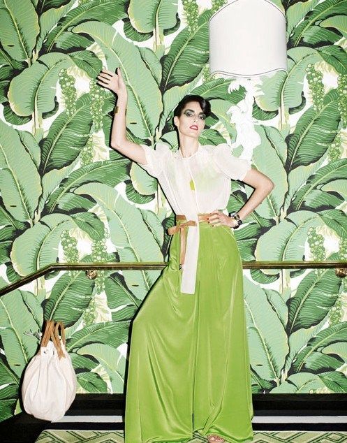
Nature has been a strong influence and source of inspiration for decor this past year. The beautiful botanicals, fabulous ferns, and pretty palm leaves have seen a resurgence in popularity. The iconic palm leaf style actually originated from Martinique Banana Leaf wallpaper, which was created by decorator Don Loper in 1942 for the Beverly Hills Hotel.

The bold wallpaper has since been transformed to more classic looking styles that can be used for any room and not just upscale Beverly Hills hotels.

Beverly Hills Hotel

Is that the lovely Lesley Ann Warren?

Read the rest of this entry »

{wallcovering wednesday: wood walls without hammer and nails}

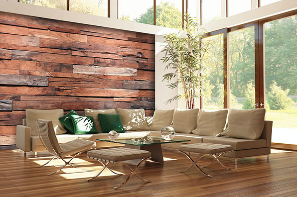
There’s something about the look and feel of wood. From the rugged wood walls in a rustic farmhouse to reclaimed wood in an industrial chic loft, wood brings a certain depth and character. And now you can achieve that look without a hammer and nails. These super-realistic photo murals and ultra-detailed wood grain wallcoverings let you change looks as quickly as you can change papers.

Reclaimed Wood

Reclaimed Wood Photo-Mural from Brewster

Brewster’s breathtaking photo-murals are hard to distinguish from the real thing. This beautifully constructed, reclaimed wood mural (above) has fascinating depth.

Read the rest of this entry »

{emerging design trend: english cottage}

Friday Finds: Enjoy Quaint Refined Style With An English Cottage Interior

Designers across the country say in 2015 we can expect less shabby chic and more refined sophistication in everything from wedding themes to interior decorating.

The trend we see emerging in the decorating world is the English Cottage interior. Here in Minnesota, that’s welcome news, as we have so many lovely 20th century Tudor-style homes – especially in the Twin Cities – that lend themselves so nicely to this elegant interior approach. You don’t need a house with a steeply pitched roof and cross-gables to enjoy the quaint refined style of an English Cottage interior. We’ve scoured our favorite resources to help illustrate this emerging design trend.

Bathrooms

An English Cottage style bathroom is light and breezy. Consider warm white paint for the trim work with touches of soft pastels for the walls, with window treatments of either plantation shutters or light white fabric.

Bedrooms

Soft floral designs whisper soothing thoughts as you drift away to sleep in an English Cottage bedroom. Note the dreamy pink and warm neutral tones in this cozy bbedroom. Fabric window treatments with matching bed linen are popular as are floral wallpaper.

Kitchens

Cottage style brings to mind finishes of warm wood, tile, stone, painted cabinets, and a soothing paint palette. It also conjures up a warm, casual atmosphere, and a charm that comes from filling your kitchen with bits and bobs that make you happy.

Living Rooms

An English Cottage living room offers guests a feeling of serenity and sense of peacefulness. Restrained use of colors and refined sense of décor throughout the room help achieve this sentiment.

For help choosing the colors to create an English Cottage style in your home, any of our Hirshfield’s paint specialists will be happy to assist.

Since Frank and Elizabeth Hirshfield opened their first store in 1894, it has been our mission to do the best job possible meeting customer needs and solving customer problems. Hirshfield’s. People and products you can trust.

{bold and beautiful wallpaper trends for 2015}

Wallpaper Wednesday: Hot Wallpaper Prints, Colors and Textures for 2015

Wallpaper continues to gain popularity with homeowners and designers. Here is our look at wallpaper trends for 2015 – the hot colors, prints and textures – from some of the top manufacturers.

Blue Mountain Wallcoverings

“2015 will bring the bold and the beautiful,” according to Blue Mountain Wallcoverings, with patterns on a larger scale and upbeat color pairings. “Blue Mountain’s 2015 collections boast a provocative and eclectic mix of large-scale patterns in sophisticated palettes of citron brights, classic neutrals and deep indigos, creating a home that is both playful and refined.”

York Wallcoverings

“Rich jewel tones have reached new pinnacles of popularity,” says Gina Shaw, vice president of new product development for York Wallcoverings. “Blue is stunning combined with analogous shades like teal and bottle green, as well as contrasting hues. It’s great for grounding an otherwise light and airy room.”

York Wallcoverings Jacobean Floral Teal

York Wallcoverings Jacobean Floral Teal

“We are increasingly finding new inspiration in opulent architecture and design rooted in the traditions of faraway places,” she says. “It’s become easier for people travel to exotic destinations and, by creating wallpapers with a global sensibility, we make it possible to bring a piece of those places home with them.”

York Wallcoverings Diamond Oasis

York Wallcoverings Diamond Oasis

Seabrook Wallcoverings

“Everything floral is in full bloom in fashion and interior design,” says Suzanne Ashley, director of product development for Seabrook Wallcoverings. “Look for an abundance of flowers in all varieties, styles, and scales to impact wallcovering, especially in watercolor techniques.” Additional influences include textures found in nature, from feathers and fossils to bamboo and cork.

Regarding color trends, she says, “the big story is BLUE – all shades. Most important is navy, with some calling it the new black. The newest blues are the deep shades – like marine blue, which is navy with a hint of green.”

Brewster Wallpaper

“Feature walls are a wonderful way for people to incorporate the colors and pattern that they love without overwhelming the room,” according to Brewster Wallpaper. “Feature walls are especially popular in the bedroom behind the bed, in dining rooms, nurseries, and used to create a special focal point in an entryway.” Brewster also says bright palettes, vivid florals, and modern geometrics will continue to be on trend, as well as global chic designs with exotic Moroccan influences.

Patton Wallpaper

Patton Wallpaper sees seafoam, aqua and light purple as trending colors for 2015, along with the classic neutral black. Gold and silver metallics add shiny accents to wallcovering patterns, or standing on their own, and ”vintage damasks are seeing a resurgence in popularity, along with florals.” Patton also sees surface prints, papers with a slight embossing or raised texture, as a trend in 2015., “and grasscloth is a classic that never goes out of style and always adds that extra layer of color and texture to a room.”

Washington Wallpaper

Lattices, damasks, and geometrics will be hot in 2015, according to Washington Wallpaper: “classic patterns that customers understand and look familiar to them, but are freshened up with a modern twist.” The updated textures show depth, which adds another layer of texture to a room without making a huge statement. “Grasscloth is huge, from tasteful naturals, to glammed up papers with a pearlized finish and metallic accents.”

Ontario Wallcoverings

Grasscloth is also one of the trends that Ontario Wallcoverings identified. “Grasscloth has always been a go-to wallpaper. We’re seeing a resurgence in its popularity with our current grasscloth book, and we’re working on the release of another grasscloth book this year.” In addition, Ontario sees another trend emerging: “We have also noticed that there has been a move from the traditional look to that of contemporary in many regions.”

Ontario Wallpaper contemporary

Contemporary pattern from Ontario Wallcovering

Mix it up with wallpaper this year. But before you begin, check out our wallpaper advice and tips or stop by to chat with one of our wallpaper and design experts. Hirshfield’s has locations throughout Minnesota, Eau Claire, Wisconsin, and West Fargo, North Dakota.

Since Frank and Elizabeth Hirshfield opened their first store in 1894, it has been our mission to do the best job possible meeting customer needs and solving customer problems. Hirshfield’s. People and products you can trust.

{using the color of contrast}

Decorating with Black and White

Color is such an important part of design that we sometimes forget the power of simple contrasts. Black and white is a classic design theme that refuses to go away, even in a world dominated by a full spectrum of color choices.

The simplicity of black and white belies its complexity. Without multiple hues to choose, shape and texture become more important. Patterns, silhouettes, and interplay rise to the forefront when decorating with black and white.

Read the rest of this entry »