{kendall charcoal hc-166}

sarah1

Apartment Therapy

sandraericksendesign copy

The island is painted Kendall Charcoal – Designer Sandra Ericksen as seen on Houzz

When did this happen? Benjamin Moore’s Kendall Charcoal HC-166 has bumped long-time favorite Revere Pewter HC-172 out of first place as most searched paint color on the Hirshfield’s blog. I was surprised. Revere Pewter has held the first place spot for the past couple years as everyone’s beige/gray favorite.

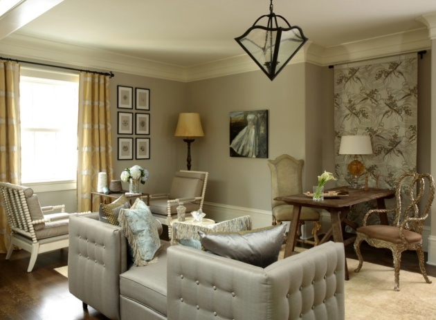
“Rich, deep, and luxurious, kendall charcoal pops beautifully when paired with crisp white room accents and trim. A versatile neutral, it also works well with most color schemes.” Benjamin Moore

gabbertsjenniferaustin-McGrath copy

Designer Jennifer Austin-McGrath from Gabberts – Houzz

meisterconstruction.ca copy

Meister Construction – Houzz

s01_rect640

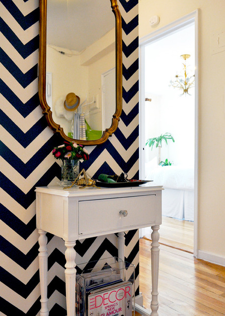
Sarah created an entryway in her apartment with this great oversized chevron pattern, painter’s tape, and Kendall Charcoal paint. With the high contrast of paint colors, charcoal and white, this small space makes a huge welcoming impact.

avenuebdev-houzz copy

Avenue B Development – Houzz

How to determine which colors are popular with Hirshfield’s customers? Talking with H’s employees who refill  the paint swatches in the chip racks and mix up the paint. How’s that for a high tech, top secret, evaluation process?

Cindy (H’s Maple Grove) tells me she is constantly filling in Kendall Charcoal (and other darker grays) on the Benjamin Moore chip rack. She thinks customers like the idea of using darker grays, but when it comes right down to it, they back off, and order a lighter and safer paint color. They mix a lot of Revere Pewter and Hirshfield’s Oak Tone 0217 at the Maple Grove store.

She’s also seeing an increased interest in accent walls – here’s where the customer will choose a darker paint color, or use wallpaper, on that one focal wall.

We painted BM Kendall Charcoal on the wall behind our bed—and it totally changed the look of our master bedroom. I love it! It looks great with white bedding and accents of either orange, yellow, red, aqua, or red. I’m currently using lemon-colored accessories! It’s a dramatic neutral color. Reader from Houzz

Want more? Color Chats from Benjamin Moore showcased their 50 favorite grays in this June blog post.

{friday finds: revere pewter hc-172}

reverepewterhirschx
J. Hirsch Interior Design

The most-searched-for color on the Hirshfield’s blog is the Benjamin Moore color revere pewter HC-172. Which makes perfect sense, because that is the most-searched-for color on Benjamin Moore’s site. What makes it so popular?

A light gray with warm undertones, revere pewter (HC-172) is a great transitional color that works equally well on walls, ceilings, and trim from room to room. Described as the perfect “whole-house color,” this classic neutral is perfect for an open floor plan.

Dark enough to contrast nicely with whites and off-whites, but not so dramatic as to compete with bold colors, it can ground and balance a room with colorful décor, or create a serene vibe when paired with pale hues and other neutrals.

It feels like the color gray has had an amazingly long run in popularity. Hirshfield’s first post on gray was done in the spring of 2009, and back then it had already been popping up on design blogs since 2008. From what I’ve been seeing, grays are still best sellers, but are warming up. “I can’t tell, is that a gray or a taupe?” Good old chameleon colors.

Two years, a Rosevillle customer used revere pewter in her lower level remodel, and with her lighting she said it took on a green undertone. It’s perfect for her space and her lower level looks fantastic. Kathy Basil (Hirshfield’s Design Studio) has found when there is a lot of natural light in a room revere pewter sometimes gets too purple. She said the Hirshfield’s paint color oak tone 0217 is actually a better color than revere pewter. It just works well in many different color scenarios. Read it and weep, Benjamin Moore.

If you think revere pewter is the color for your room, step over to the Hirshfield’s chip rack and pull a sample of Hirshfield’s oak tone 0217. Remember we sell pints and quarts so you can test drive your paint colors before you purchase paint for your entire room. You don’t have time to hide all those gallons of the wrong paint color (in the trunk of your car) and start all over. True story.

For more comments on revere pewter, here’s a link to Benjamin Moore. I always enjoy reading what “real people” have to say about their paint colors.

Happy Painting!

{friday finds: it’s too red…too purple…too something}

Coventry-Gray-HC-169 from Maria Killam

What paint colors are on the minds of Hirshfield’s customers when they walk into our stores?

Jill ( Hirshfield’s Edina) tells me their customers like the idea of using gray and try to use gray in their homes. Guess what? A number of customers return to the store enveloped in a cloud of gray ennui. Gray ennui?  The gray is either too green, too cold, too brown, too something, and it just doesn’t look “right.” Those sneaky undertones. The chameleon among colors, gray is a classic, refined neutral that works well with any color scheme. Depending on the shade, it can be cool and calming or, with a little bit of silver, energetic.

Customers ask for the perfect gray. There is no perfect gray. Every customer has a different perfect gray. When shopping for paint bring along your existing interior finishes if you can, as this makes it easier for Hirshfield’s staff to find the perfect gray for you.*  Your carpet may have a green undertone and your favorite gray paint has a red undertone. This is the reason why your room will never look “right.”

Color Chats, by Benjamin Moore, helps point color-troubled customers in the right direction with this recent blog posting:  Fifty Shades of Gray {Paint}. Michelle Zakko has curated 50 enticing grey, greige, and gray room settings for your viewing pleasure.

Benjamin Moore’s five favorite grays

Customers from the Edina store are also looking at the colors of sea glass, plum, taupe, with a few forward-thinking, orange and kelly green customers.

Rhubarb 2007-30 Benjamin Moore

If fifty shades of gray paint doesn’t do it for you, Conspicuous Style recently shared her favorite paint colors…her top 100 Benjamin Moore paint colors! Can you see why rhubarb is a favorite, especially when it’s sharing space with turquoise.

Thanks, Jill for sharing your customer observations. Stop by any Hirshfield’s location for a color chat with one of our undertone experts.

*Is a color call what you need? For information on the personalized service of an in-home paint consultation, click here.

{friday finds: gray, grey, greige}

Benjamin Moore Revere Pewter HC-172 – DecorPad

The color gray is a gray area. It is a complex color. “That’s not gray, that’s…”

The shade of gray that is “in” right now is a brown gray. It looks good with the warm tones that have been trendy the last few years. When asked about customers’ preferences, Michelle from the Edina store, agrees, ” people usually shy away from the cooler grays and gravitate to the brown grays.” When selecting a gray paint color, pay attention to the undertones. Are you seeing a blue-gray, a purple gray, a green gray? Pearl grays can be iridescent and have purple and pink in them. A good charcoal gray is closer to black, but much softer than black. So many choices.

I pulled some reader comments on grays from Apartment Therapy postings. If you are searching for a gray you may find these comments helpful.

… my dining room is Benjamin Moore’s Metropolitan AF-690, from their Aura paint line. It’s a nice bluey grey as well…

…Ralph Lauren Soft Earth UL29 is a nice grey that would still look good with golds…also, Forde Abbey TH06 is a great color…

A few years ago I painted the entire inside of my house BM’s Balboa Mist 1549. It’s a soft grey that changes with the light. Decorator white woodwork and black doors with brushed silver knobs. Loved it every day. Very fresh….I’m addicted to gray!

I recently painted with Benjamin Moore Feather Gray 2127-60, and it’s gorgeous. Depending on the light, it can look sort of blue or silver, and it’s just such a soft shade, like a bird’s wing…

I love gray and found BM Stonington Gray HC-170 here on Apartment Therapy. Everyone said it was the most neutral gray and did not take on purple, green or blue the way some grays do. Oh, how right they were…

Benjamin Moore Coastal Fog 976 is a color offers a wonderful chameleon-like background for other colors. I had it with a white sofa and chair and smaller accents of bright, light green — also had deep brown. It also looks fabulous with red and with black…

Our new grey is Ralph Lauren’s Artist’s Studio VM 157. LOVE it. Has more of a blue undertone than brown.

Currently, my bedroom is Gray Owl 2137-60 and OC-52 (Benjamin Moore). It’s really subtle, with a hint of green. (I also have a bathroom painted Pigeon Gray 2133-50 (BM). That’s a nice deep gray with purple undertones.

We’ve got you covered with the warm and cool grays found in this wallcovering – Ideal Home

Ideal Home

Chelsea Gray (HC-168) is the background in Brooke Shield’s NY living room.

Can’t commit to grey on your walls? Image from Vtwonen found on Decor8

Metallic wallpaper from Graham& Brown – Ideal Home

Benjamin Moore Nightingale AF-670 – Pottery Barn

Cow Parsley wallcovering by Cole & Son

Benjamin Moore Whale Grey 2134-40 and Deep Space 2125-20

For more photos of this space visit Cheeky Living.

Ideal Home

Benjamin Moore Kendall Charcoal HC-166

Benjamin Moore Abalone 2108-60 (The lighter grays are hard to see in photos)

This is a work in progress from china shepherdess.

Love the gray and black accents – Ideal Home

When looking for paint colors remember to bring in fabric samples, flooring, or whatever you have available, so Hirshfield’s sales staff can assist you with your paint and wallpaper selections. If you can’t see the difference in a purple gray vs. a green gray, not to worry, that’s when our sales staff can be of assistance. They work with color every day, all day. Grab some samples and audition them with your finishes, your lighting, your husband (not really), in your home. Need more one-on-one assistance, think about a color consultation.

Check out the paint coupons on the Hirshfield’s website and this last link to gray.

{friday finds: top 12 benjamin moore paint colors}

“Popular Benjamin Moore colors,”  “Benjamin Moore,” and “best-selling Benjamin Moore colors” are search terms people are using to find their way to Hirshfield’s Color Club blog. So here they are. Benjamin Moore’s most popular colors, starting with the top seller White Dove. If you are looking at traditional neutral colors for your home this is a good start. After the whites, creams, tans, and beiges you’ll find the two best-selling colors…thus twelve.

What are Hirshfield’s customers buying? We’ll let you know the best-selling Hirshfield’s Paint colors and Benjamin Moore colors in the next couple weeks.

Enjoy your weekend. Shop local. Thank you for your business.


November 17, 2011

Our list needs a quick touch-up…

The most searched paint colors, by visitors to the Benjamin Moore site, are still the majority of colors listed in this post from a year ago. Bumped from our list are: Putnam Ivory, Powell Buff, Concord Ivory, and Saybrook Sage.

The three colors new to the list are: Revere Pewter (HC-172), Hawthorne Yellow (HC-4) and Benjamin Moore’s Color of 2012 Wythe Blue (HC-143).

   revere pewter 

HC-172

A light gray with warm undertones, this classic shade creates a unifying look that calms and restores. A great transitional color, it’s perfect for an open floor plan.


   hawthorne yellow

HC-4

This historical color is reflective of traditional architecture, but also works beautifully in modern homes. The slight gray undertone makes it usable in any room.


   wythe blue
   HC-143
We have chosen wythe blue (HC-143) as Benjamin Moore’s 2012 Color of the Year. It’s a beautiful, calming hue that has an element of heritage that offers grounding rootedness, providing comfort and stability.