The return of warm weather means it’s time to get outside in Minnesota! Spring is the perfect time to open up your windows and revamp your front porch so you can enjoy the outdoors for the months to come. But time is wasting, so here are some decor tips for a quick and easy front porch makeover.
Paint the Front Door

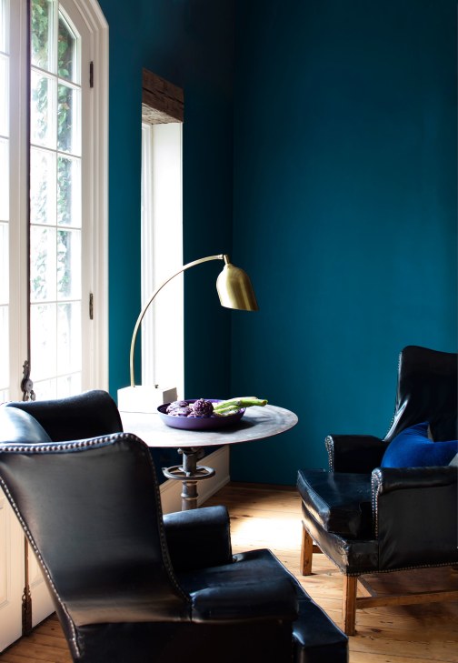
Minnesota ASID Showcase Home 2015
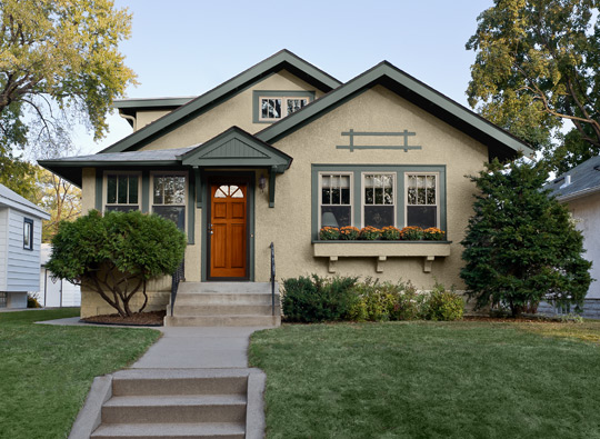
For the biggest impact, add some bright, inviting color to your door and accessories. Whether you go bright or light the key is using complimentary colors. For every blue, green, or violet, choose an orange, red, or yellow.

Credit: Hannah Brown
If you’ve got warm brick or siding, try a cool color like spring green, teal, or turquoise. If you’ve got white siding, no color is off limits — not even this canary yellow.

Credit: LDa Architecture & Interiors
Plant Your Flowers
Flowers and planters are another quick fix, but you need to be thoughtful for maximum impact. These planters are a great choice because they are similar to the chandelier in shape, but opposites in finish — traditional warm metal compared to a contemporary cool plastic.

Credit: Historical Concepts
Turn On The Lights
Adding new lights will give new life to your porch. It will make your entrance bright for all those late-night comings-and-goings if you’re looking for safety and security. Don’t forget about scale. People often make the mistake of not buying large enough outdoor fixtures. Looking for the soft glow of porch ambiance? Welcome your guests with a string of decorative twinkling lights.

Credit: JS Interiors LLC
Add More Furniture
If you have enough space, consider adding more furniture to create a room with a view. Whether it’s conventional wicker furniture to create a three season sitting room, or the right rug, and chairs, you’re sure to enjoy the warm breezes all summer long.

Minnesota ASID Showcase Home 2015
Give it a Swing
And if there’s one look that’s made for any porch lover it’s the porch swing. This updated swinging sofa completes a classy yet comfortable porch combo – perfect for enjoying a late night in the still summer air.

Minnesota ASID Showcase Home 2015
Whether your goal is extra color or extra comfort — or both — the right choices can add to your curb appeal and the enjoyment of your home. So, now that you’ve been inspired, how will you make over your front porch?
Check out Benjamin Moore’s
photos for an inspired exterior. Paint is your best friend when it comes to upping your curb appeal!
Since Frank and Elizabeth Hirshfield opened their first store in 1894, it has been our mission to do the best job possible meeting customer needs and solving customer problems. Hirshfield’s. People and products you can trust.