Window Treatment Wednesday: Window Covering Safety Month

window covering safety month

October is Window Covering Safety Month

The Window Covering Safety Council (WCSC) and the U.S. Consumer Product Safety Commission (CPSC) want to remind everyone about the hazard window covering cords can pose to young children and pets. The Consumer Product Safety Commission (CPSC) says window treatment cords are one of the top five hidden hazards in American homes, with infants and children accidentally becoming entangled in window cords. Their message needs to be heard by everyone, not just parents or caregivers.

Here are some tips from the Window Covering Safety Council (WCSC) to keep in mind:

  •  Install only cordless window coverings in homes with young children.
  •  Continuous-loop pull cords on draperies and vertical blinds should be pulled tight and anchored to the floor or wall.
  • Move all furniture, cribs, beds and climbable surfaces away from windows and window cords.
  • Make sure tasseled pull cords are as short as possible.
  • If you cannot replace older window treatments, this link offers instructions on how to retrofit them.

Not quite certain what your options are? Hunter Douglas has a wide array of lifting systems for child and pet safety. Also, the Window Covering Safety Council website has tons of valuable  information.

Since Frank and Elizabeth Hirshfield opened their first store in 1894, it has been our mission to do the best job possible meeting customer needs and solving customer problems. Hirshfield’s. People and products you can trust.


Friday Finds: Farrow & Ball Wallpaper

farrow&ball wallcovering

Farrow & Ball devotees know they can count on the brand’s ab-fab paint colors, cutting-edge wallpaper patterns, and exceptional quality. They also know how to be patient. Farrow & Ball introduces only a handful of wallpaper patterns each year and new paint colors are introduced to the Farrow & Ball palette every three years. This year’s wallpaper introductions are three modern floral designs that can work as feature walls or in a whole room. Here are the brand new patterns for 2017 and the inspiration behind them:

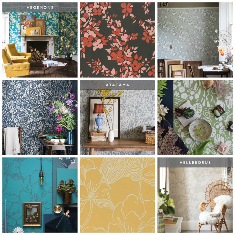
  • Hegemone takes it name from the Greek goddess of fruit and flowers. This pattern is described as “less rigid and defined than a classic floral pattern.” If you like movement on your walls then this is your pattern.
  • Atacama* is named after a flowering desert in Chile and inspired from a fabric swatch found in an old fabric mill. Atacama is a mix of flowers and cacti creating a “fun tropical design.”
  • Helleborus is Latin for the hellebore flower and inspires “a sense of growth and rejuvenation. Helleborous is one of the largest designs in their wallpaper collection.

Farrow & Ball wallpapers are made in England by craftsmen (and women) who take great pride in their workmanship. Printed with Farrow & Ball paints in a traditional block-printing method gives the wallpaper a luxurious texture. It also makes it easy to create a style that is cohesive and a room that is inviting since you won’t have to try and match up paint colors.

You’ll want to stop by to feel and see the new collection for yourself – available exclusively at our Edina location.

*Have you seen the James Corden commercial with Chase Sapphire? One of the travel people say, ” I think you should come camping.” James Corden: “Why would I camp in the Atacama Desert?” I feel so smart – I know where the Atacama Desert is. Thank you, Farrow & Ball.

Since Frank and Elizabeth Hirshfield opened their first store in 1894, it has been our mission to do the best job possible meeting customer needs and solving customer problems. Hirshfield’s. People and products you can trust.


Century Paint by Benjamin Moore

Century Paint by Benjamin Moore

America’s favorite paint company introduces 75 new colors and first-ever soft touch matte finish.

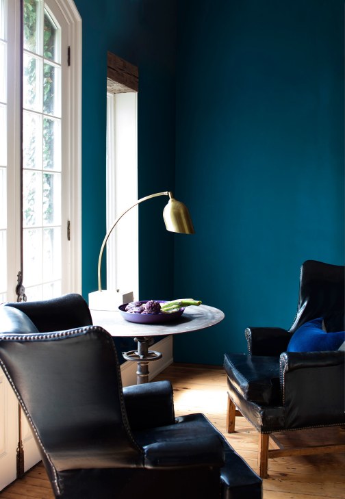
Earlier this spring Benjamin Moore launched CENTURY, a new line of pre-mixed, small batch, ultra-premium paint in a “soft-touch matte” finish. The palette consists of 75 brand new colors, ranging from mid-tone to dark shades, intended to enrich the color collection of interior designers.

 “We needed something for the architects and the designers—something more elevated and more studied,” says Benjamin Moore creative director Ellen O’Neill, who has been working on the collection for more than five years. “So we really went back to the hand of the artists.” It started with texture or, as O’Neill puts it, making “more of a covering than a coating.” She explains: “You can almost see a nap in it when you turn a certain way or see it in profile. It beckons you to touch.

Century Paint by Benjamin Moore

Century Paint | Cobalt

Read the rest of this entry »

{how hot is too hot? advice for exterior painting in a heatwave}

When temperatures reach the 80’s or higher, you might not even be tempted to leave the air-conditioned confines of your home or workplace, let alone work on house projects outside.

But these high temps beg a pretty common question — how hot is too hot for painting?

The ideal temperature depends on what type of paint you use.

We recommend 100% acrylic paint for most exteriors, and these latex paints work best when applied in temperatures between 50° and 85° Fahrenheit. However, if you decide to use oil-based paint, their ideal range is slightly broader — 40° to 90° Fahrenheit.

High temperatures bake paints.

At best, a too-high temp will cause the paint to dry too fast. With too hot of a surface, the paint never gets a chance to adhere and possibly leaving you with a cracked, peeled, or blistered exterior (below).

IMG_0160

But Midwesterners know that temperature isn’t everything when it comes to working conditions! When painting the exterior of your home, you also have to consider precipitation, humidity, and wind speed.

Don’t work in wet or humid conditions.

You probably know that you shouldn’t apply fresh paint during, before, or after rain — but did you know that high humidity can lead to almost as many issues? The paint wants to dry but it can’t dry. Humidity causes condensation, which affects adhesion, which can result in streaks or faded spots.

The wind is no friend to paint.

Windy conditions blow debris into your paint and can lead to uneven drying. If the wind is blowing more than 15 miles per hour, it might even blow you off your ladder! The best wind speed for painting is anything under 8 mph — which is basically a gentle breeze.

Consult weather forecasts before scheduling time to paint.

Check your forecast for:

  • Temperatures between 50° and 85° Fahrenheit
  • Mild humidity between 40 and 70%
  • A stretch of time that will avoid precipitation – 24 hours before and after application

If you’re looking for a reliable weather report resource, forecast.io aggregates several different predictions together to give the most likely weather possibility.

Consider the house and the painter.

For best results, paint opposite the sun.

Painting between 10 a.m. and 3 p.m. on a mild day will:

  • Ensure you have plenty of light to see what you’re painting
  • Let the house dry off any morning condensation
  • Give the exterior time to warm to the right temperature
  • Allow the paint to dry before the cool night comes

And if you have additional questions about painting conditions, ask the experts in our paint department. They love to help!

Since Frank and Elizabeth Hirshfield opened their first store in 1894, it has been our mission to do the best job possible meeting customer needs and solving customer problems. Hirshfield’s. People and products you can trust.

Save

Save

{wallpaper wednesday: thibaut grasscloth resource vol. 4}

Established in 1886, Thibaut (pronounced Tee-Bo) is the nation’s oldest continuously operating wallpaper firm. Thibaut’s product offering has broadened to include a variety of coordinating print fabrics, furniture, embroideries, and woven upholstery fabrics. Here’s a look at their newest collection of natural wall coverings, Grasscloth Resource Volume 4 is filled with grasscloths, raffia, paper weaves, and sumptuous sisal.

With a palette that is both bold and sophisticated, the striking textures of these wallcoverings provide a level of natural beauty, depth and dimension that few other home decor products can rival.” 

Thibaut Grasscloth Resource Vol. 4

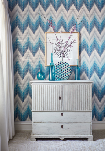
Piedmont is a large-scale printed chevron in multi-color layers. A hint of metallic shines through from the ground.

Read the rest of this entry »

(wallpaper wednesday: scandinavian designers II)

Scandinavian Designers II wallpaper book

Wallpaper. Scandinavian. Retro. This new wallpaper book has it all!

This collection features patterns from no less than five different designer icons within architecture and pattern design during the 1940’s – 1960’s. Browse through the characteristically timeless, geometric functional style of Arne Jacobsen, the decorative fairy tale patterns of Stig Lindberg, the Jobs sisters’ treasure chest of classic, flowery patterns and the stylish, sketched foliage of Viola Gråsten.

All of the patterns in the collection have a natural, colourful and imaginative touch that make them a perfect complement to the understated, clean Scandinavian interior design. Classic and contemporary have never been more to the point.

wallcovering by Scandinavian Designers II

The pattern with its stylized green leaves is one of the most loved by the Swedish people. The china was sold in immense quantities during the 1960’s and is considered an icon in Swedish homes today.

Read the rest of this entry »

{friday finds: millennial pink}

millennial pink

Sonhas Rosa! An old Portuguese phrase for what we are all doing – dreaming in PINK!

It’s no secret, pink is having a moment. Whether you’re wearing it or drinking it (hello rose), it has come to be the defining color of the millennials, so much so that is referred to by many as “millennial pink”. But why? Read the rest of this entry »

{artisan home tour 2017}

artisan home tour 2017

If you’re shopping for a new home, looking for inspiration, or thinking about a remodel, the Artisan Home Tour  should be on your weekend radar. Step inside these luxury homes, from the area’s most exclusive builders and remodelers, and see for yourself why these are million-dollar-plus homes.

ARTISAN HOME TOUR 

The Artisan Home Tour features 19 new one-of-a-kind homes and two remodels which will be open this weekend, the final weekend of the Home Tour.

The following homes all used products from Hirshfield’s!

  • Home #1 Lecy Brothers Homes & Remodeling: Interior and Exterior | Painting by Cityscape
  • Home #3 Stonewood, LLC: Exterior | Painting by Cityscape
  • Home #6 Denali Custom Homes:  Interior and Exterior | Painting by Legatt Decorating
  • Home #9 John Kraemer and Sons:  Garrison Landing Project. Cityscape painted all of the common areas including the corridors, lobby, and stairways.
  • Home #11 Carl M. Hansen Companies: Interior and Exterior | Painting by Cityscape
  • Home #12 Narr Construction, Inc:  Interior and Exterior | Painting by Cityscape
  • Home #13 Great Neighborhood Homes, Inc. Interior and Cedar Exterior |  Painting by Archer Painting
  • Home #18 Highmark Builders: Interior and Exterior | Painting by Cityscape
  • Home #19 Hendel Homes: Interior and Exterior | Painting by Cityscape

Tour details available here.


Since Frank and Elizabeth Hirshfield opened their first store in 1894, it has been our mission to do the best job possible meeting customer needs and solving customer problems. Hirshfield’s. People and products you can trust.
SaveSave

{colors of the day: red, white, and blue}

Celebrate Flag Day with these patriotic inspirations.

How did the iconic red, white, and blue come to be? These shades now synonymous with freedom, equality, and baseball inspire patriotic pride throughout the country. The rich story behind these historic hues may surprise you.

a2e367c68122433e90f755b785947a55

Let red, white, and blue serve as your color palette.

DIY American flag

Display your patriotic pride year round with a DIY painted flag.

History of the Flag

What is known is that the first unofficial national flag, called the Grand Union Flag or the Continental Colours, was raised at the order of General Washington near his headquarters outside Boston, Mass., on Jan. 1, 1776. The flag had 13 alternating red and white horizontal stripes and the British Union Flag in the canton.

The first official national flag, also known as the Stars and Stripes, was approved by the Continental Congress on June 14, 1777. The blue canton contained 13 stars, representing the original 13 colonies.

After Vermont and Kentucky were admitted to the Union in 1791 and 1792, respectively, two more stars and two more stripes were added in 1795. This 15-star, 15-stripe flag was the “star-spangled banner” that inspired lawyer Francis Scott Key to write the poem that later became the U.S. national anthem.

In 1818, after five more states had gained admittance, Congress passed legislation fixing the number of stripes at 13 and requiring that the number of stars equal the number of states. Before 1912 there were no specific guidelines as to how the flag should look. President Taft presented guidelines regarding the configuration of the stars in the 48-star flag. The last new star, bringing the total to 50, was added on July 4, 1960, after Hawaii became a state.

Through the words of the founding father himself, we gain a perspective of the American flag. “We take the stars and blue union from heaven, the red from our mother country, separating it by white stripes, thus showing that we have separated from her, and the white stripes shall go down to posterity representing liberty,” interpreted George Washington in 1777.

Today the flag consists of thirteen horizontal stripes, seven red alternating with six white. The stripes represent the original 13 colonies, the stars represent the 50 states of the Union. The colors of the flag are symbolic as well: Red symbolizes Hardiness and Valor, White symbolizes Purity and Innocence and Blue represents Vigilance, Perseverance and Justice.

Since Frank and Elizabeth Hirshfield opened their first store in 1894, it has been our mission to do the best job possible meeting customer needs and solving customer problems. Hirshfield’s. People and products you can trust.

{how to pick the right paint color for your home}

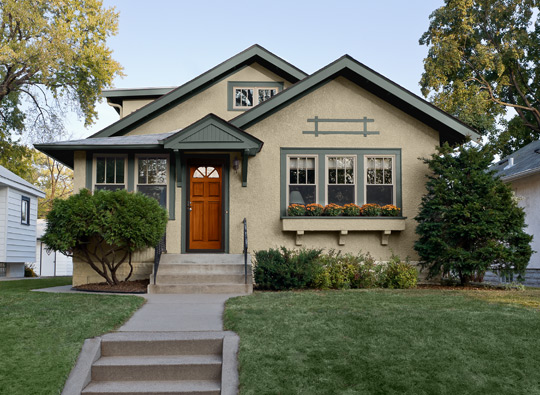
Painting the exterior of your home doesn’t happen often, so when you’re deciding on a color, you have to be 100% confident that this color will be timeless, elegant, and beautiful.

At Hirshfield’s, we carry countless exterior paint colors to choose from, giving you the freedom to explore to find the exact color you are looking for.

18835732_10155501724041323_3298177617928850325_n (1)

Siding: Sag Harbor Gray HC-95 Windowpanes: Midsummer Night 2134-20 Door: Gloucester Sage HC-100 All by Benjamin Moore

Here are some tips to consider when deciding on an exterior paint color for your home:

  • Consider pre-existing factors such as roof color, chimney, trim—if you aren’t planning on painting it—and landscape. Roof color is especially important because unless you completely re-roof your home, it isn’t going anywhere for a while. So instead, find an exterior paint color that complements the color of your roof.
  • If your home has stone, copper, or brick accents, consider a color that will accentuate the current elements that make your home truly beautiful.

Gray Benjamin Moore Exterior

Revere Pewter (HC-172), Night Train (1567), Firenze (AF-225)


  • When deciding on an exterior color, feel free to focus on not only the body of the home, but also the trimming, shutters, and door. It can really make a home come to life if all three of these components complement each other seamlessly.
  • Be aware that paint samples can often look darker or richer in-store than they will appear when they are applied to the exterior of your home. Don’t be afraid to sample paints before tackling the entirety of the project.
  • Take note of the color palette of the surrounding homes or landmarks in your neighborhood. Originality is important as you don’t want to completely blend in among the masses. However, showcase your individuality without stepping on neighbors’ toes (i.e. painting your home Pepto Bismol pink when the neighborhood has chosen a more neutral palette!)
Exterior paint colors

Lower Body is Hirshfield’s Historic Tankard Gray, Upper Body HC-87 Ashley Gray, Trim and Shutters, 0197 Thistle Gray. Color schemed by Mark Masica, Hirshfield’s Color Services

Neutral exterior colors have remained timeless and popular in Minnesota throughout the years. The above homeowner chose a neutral palette which really played up their stone accents nicely.

When selecting exterior paints be sure to check out Hirshfield’s and Benjamin Moore paints for durability, ease of application, resistance to mildew, mold, and UV rays, and overall performance.

benjamin moore paint regal select

REGAL SELECT ON SALE

Now through June 17, Regal Select Exterior and Interior Paints are $10 off per gallon.

Regal Select Interior available at all Hirshfield’s stores; Regal Select Exterior available at select Hirshfield’s locations. Regal Select Exterior may be special ordered in, or Benjamin Moore Aura Exterior may be purchased at $10 OFF msrp at all Hirshfield’s locations.

Happy weekend and painting!

Since Frank and Elizabeth Hirshfield opened their first store in 1894, it has been our mission to do the best job possible meeting customer needs and solving customer problems. Hirshfield’s. People and products you can trust.